David Howell PPRSMA
Green is just another colour but very often it is considered a major problem area for many painters. For landscape artists in particular, there is a lot of it about and anything more than a casual glance at trees, fields and vegetation in general, will show that green comes in an extraordinary range of tones and colour. If you fail to get somewhere near this variation in your paintings, your greens will look flat and unreal.
So, if greens are constantly varied rather than flat colour, it follows that just painting them with green from a tube isn’t going to work too well. For me the secret of getting decent greens is to use the complementary colour principle and not to over-
Most manufacturers’ of paint have a large number of greens in their range and I guess if you buy pretty well the whole lot, you will have spent rather a lot of money and some of them will still bear no resemblance whatsoever to what you see outside. Perhaps a better bet is to select a few only and be prepared to modify them to the appropriate colours and tones, or my way is really not bother with manufacturers’ greens most of the time and to make my own from the primary colours.
It isn’t as difficult as some claim but the secret lies in delicate brushwork with big brushes and plenty of water. We all know that blue and yellow make green, so that bit’s easy and it follows that if you use different versions of blue and yellow you will get different shades of green but if you introduce red into the equation (i.e the complement of green) then the variety is endless.
WORKING WITH GREEN
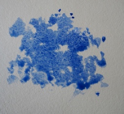
I start with blue. If I’m painting a tree, the shape of the foliage is painted loosely and with rough edges – trees aren’t smooth and regular in shape and it’s important to remember to leave holes for the sky to show through in places. This one was painted with ultramarine and into the puddle of blue I gently introduce a little alizarin.
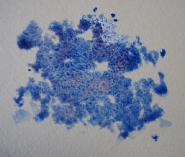
The mix now has a little Alizarin added. Note the word little -
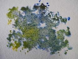
This is the exciting bit. Cadmium Lemon has now been introduced to the mix. Not painted in but slipped on to the surface with light touches so that the tones are varied and you can see that the puddle at the top is threatening to get out of hand. It’s like magic and this process can now be controlled by balancing the 3 colours against each other – the mixture of 2 of these primary colours will be the complement of the 3rd and therefore is able to intensify, darken or de-
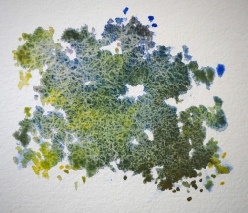
Above all it mustn’t be overworked – too much mixing and brushwork will turn the whole thing muddy and horrible. There’s a lot of water involved and and where the puddles of paint have become too pronounced I’ve gently used a sable brush to soak up the excess without disturbing the surface, otherwise there’s a danger of the excess moisture causing tide marks as it dries. Note also that I’ve created some light direction so that there’s a light and shady side of the tree to give it form.
This demo was painted in a Two Rivers handmade paper 20 x 20 cm sketchbook, with a Pro-
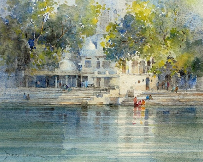
Lakeside Udaipur Watercolour 24 x 29 cm. Painted on Khadi paper
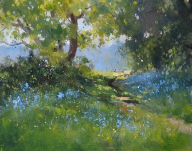
Bluebells on Stearsby Hag 8 x 10” Oil on panel I use the same mixing process for oil. This was painted with Daniel Smith water soluble oils